
HUD & interface
The game-like HUD (desktop + mobile) built from the bronze/leather sprite kit, every widget's position and states, the Mouse1 chain bar, the window system (ornate headers, 11-slot equipment), and how the HUD art is produced and tested.
The HUD is a kit: 14 sprite pieces (ART-HUD-001…014), the UI sprites cut from the accepted art
(see UI components, the single visual reference) and a layout contract (hud.json) that the wiki renders
live and the client must match. The owner's reference screenshots (desktop + mobile) are the target composition; the
full-screen concept prompts are ART-HUDMOCK-desktop and ART-HUDMOCK-mobile.
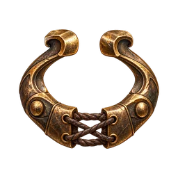
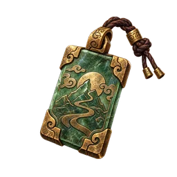
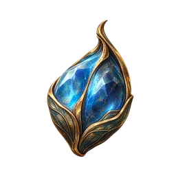
◆Layout principles
- Keep the centre clear. Only world-space nameplates, telegraphs and damage numbers live in the middle 50%.
- Anchor to edges. Every element is anchored to a corner or edge and scales with UI scale (80–130%).
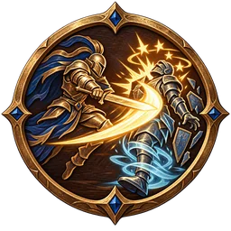
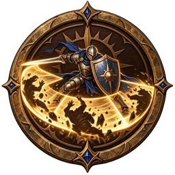
- States are visible. Cooldown sweep + seconds, a 150 ms gold flash when ready, desaturated + blue when out of mana, a pulsing border when an input is buffered, a small slot number (1–8) on skills in the Mouse1 chain, and a gold "if" badge on a finisher that lights up while its condition holds on the target.
- Touch first on mobile. 48 px minimum targets, thumb arcs, a floating joystick, an edit mode (drag/scale/opacity) and a left-handed mirror.
◆Desktop layout
| Element | Position | Notes |
|---|---|---|
| Buffs/debuffs | top-left | 12 icons, timers, stacks |
| Target frame | top-centre | level diamond, coloured name, ★ elite, HP, ailments, cast bar |
| Menu + minimap | top-right | 8 round buttons, round minimap with compass, channel number; click the minimap to travel there |
| Auto toggles | under the menu | Auto-Hunt (G), Auto-Quest (H) |
| Quest tracker | right | main + 3 side quests, current Auto-Quest step |
| Chat | bottom-left | tabs + input |
| HP · level · MP | bottom-centre | the owner reference's diamond medallion |
| Quick bar 1–8 | above the skill bar | potions, buffs, scrolls |
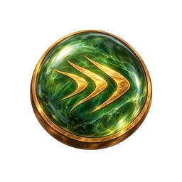
| Skill bar | bottom-centre | Q E Z X C (skills or buffs) · M1 chain strip (up to 8 slots, next slot glows) · M2 movement gem |
| Quick bar F1–F8 | right of the skill bar | compact 4×2 grid, collapsible |
| EXP bar | bottom edge | 10% notches |
◆Mobile (landscape)
Portrait + HP/MP top-left, target top-centre, menu + minimap top-right, quest tracker right; floating joystick on the left; big Attack button (the Mouse1 chain list, hold = continuous) bottom-right, with Q E Z on the bottom arc, X C above, M2 beside Attack, quick potions 1–4 on an arc (long-press for more), and Auto/target toggles on the right edge.
◆Windows
Inventory (I), Character (U), Codex (K), Atlas (P), Map (M), Quests (J), Social (O), Options (Esc), Stash, Blacksmith, Stall, Stablemaster. Every window is built from the kit: the bronze window frame, glass or stone body, item wells and sockets. Live mockups for desktop and phone are on Game windows. There are two header types:
| Header | Used by | Rule |
|---|---|---|
| Rail header (leather rail with caps) | popups, dialogs, plain panels and page heads (windows without a close button) | Sits on top of the window; the body frame starts under it and never paints over it. Both caps are ornaments; the right cap is the close-button ring only when a close button sits in it (an empty ring reads as a missing button). |
Crest window (ui/window-crest, owner sketch art/owner-refs/hud/window-artwork-idea.png) | custom game windows with a close button: Character, Inventory, Stash, Quests, Social, Map, Options, vendors | Outer container: minimal bronze rim and a subtle background (window-outer); close button in its top-right corner; resize grip bottom-right. Crest (rounds 6–7): the feathered wings stand on a thin bronze rail along the inner panel's top border with no background behind the ornaments; the title sits in a bronze frame whose container is gold (dark engraved title text, round 7), the ZOEN medallion above it; the crest is at most 560 px wide (1080p) and scales down on narrow windows; the title sits 3 px lower on its cartouche (round 8). The title is centred on the cartouche, shrinks from 16 px to 10 px, then ends in an ellipsis. Inner panel: the regular window frame. |
- Character: portrait + level, life/mana/armour, the STR/AGI/INT dial triad, the 8 Mouse1 chain slots + Q–C, XP, Offence/Defence/Misc/Buffs tabs.
- Inventory (docked right, 620 × ~910 px at 1080p, 48 px cells —
ui-windows.jsonis the contract): the 11-slot equipment area on a 12×7 cell grid (armour 2×3, weapon and off-hand 2×3, the same footprint a weapon takes in the bag, helmet/gloves/boots 2×2, belt 2×1, earring and necklace beside the helmet, rings beside the armour), quick slots 1–8, gold + Zoe, a 12×5 bag. Drag and drop (or click to pick up / click to place): valid slots glow jade, invalid ones (wrong slot, unmet requirement, off hand behind a two-hander) turn red and refuse the drop; right-click equips. Quick slots 1–8 take potions and scrolls only (drag in, drag between slots to swap). Sockets show over an equipped weapon or belt on hover: click a gem to pick it up and hold it on the cursor (it leaves the socket only when you place it; Esc puts it back), drag a gem onto the item or a socket to insert it (weapon: primary + 2 supports; belt: movement + 2 supports). Item art is scaled by its painted content, so long weapons stand upright and fill their 2×3 slot and belts fill 2×1. Stash: 4 tabs × 12×10, stacks to 999. Look: the equipment area sits on a painted backdrop (inventory-backdrop) with subtle recessed slot boxes (code-drawn, not flashy). The bag and stash are one plain grid built from a repeatable tile sprite (grid-tile), so any grid size reuses it. The tile behind an item is blue when usable and red when its requirements are not met. It is never tinted by rarity; rarity shows in the name colour. The Cosmetics tab sits on the right and stays disabled until costumes ship. Window size at 1080p: 620 px wide (12 × 48 cells + 44 px of window chrome: 6 px rim + 8 px inner padding + 8 px equipment gutter per side; outer container padding 0, inner panel padding 12 / 8 / 8), so the grid is never cut; the cell shrinks only when the page is narrower. - Inventory look (round 7): the painted backdrop is pale and quiet so the slot boxes stand out; weapon and off-hand were
2×6 in round 7 (now 2×3, see round 8). Sockets use the bronze circle art, are laid out so they never overlap
(vertical on tall slots, horizontal on the belt) and highlight on hover (no scaling). A gem can be dragged out of a socket
(a click picks it up and holds it) and into another. Always exactly 1 main gem + up to 2 supports per item: a second
main gem is refused ("already has a main gem"). The drag ghost keeps the size of the art you grabbed. Under the grid: a
gold box (stack-of-coins art) and a Zoe box (sun coin), then the character line (
Boran · STR 124 · AGI 48 · INT 42with the stats icon). No help text; action feedback is a short toast over the grid. - Inventory (round 8): the weapon and off-hand slots are exactly 2×3 (the bag footprint of a weapon), sit 74 px in from the panel sides and 70 px from its top (
offsetPx, scaled with the cell) and the equipment panel's backdrop runs down through the quick-slot (potion) row to just above the bag; the Inventory / Cosmetics tabs sit a little inside the panel; the gold and Zoe boxes are lower. Pressing an equipped item scales it down ~7%, and equipping plays a small settle (scale-down) on the slot. - Character window (round 8): same 620 px width and padding as the inventory. Portrait at the top of its block with the bronze level medallion on its corner (no medallion beside the EXP bar any more, which keeps its end-to-end gold fill). The 8 chain slots + Q–C are smaller (34 px) in the delivered round HUD slot frame with a keycap plate (
ART-HUD-002), inside a bronze frame on a painted backdrop; the stat tab body sits in a framed container. - Social (round 8): every member row uses the same three columns, so all HP bars share one width; the bar is the bronze field frame around the delivered red liquid (
ART-HUD-004), not a plain box. - Page and window headers (round 8): a panel's header sits on top of its body: the rail is transparent around its ornaments and the framed body (and glass) starts under it. The same rule applies to page heads, plain windows and dialogs.
- Map window: art waypoint markers (done / current / locked / town), a smooth road with the travelled part lit, a "you are here" pin whose tip sits exactly on the centre of the current waypoint circle (round 8: circles are smaller, 76 map units), and no extra bordered containers.
- Options: one vertical scroll with section headings (no tabs). Every dropdown menu renders in a portal on the page body, so a parent with overflow:hidden/auto can never clip it (it flips upward near the bottom edge).
- Loading screen: the gold progress runs end to end between the rail's left ornament and right ring (no gutter); the area title sits on the gold plaque whose centre and caps are one material.
- Codex: picks left, the skill list per codex, ranks, facets, and the chain editor (8 numbered slots, attack skills only).
- Atlas: the same Canvas renderer as this wiki's Atlas page.
- Options: driven by
controls.jsonsettings (chain slots, finisher behaviour, Alt affix tiers, accessibility). - Every item, skill, orb, gem and node opens the shared popup on hover (tap on mobile).
◆Popup content standard
Every popup uses the same order: header (title + subtitle) → art → identity line (slot, item level, tier, refine, unlock level) → blocks → footer hints.
| Element | Use | Never |
|---|---|---|
| Title | one line, rarity colour for items; shrinks from 16 px to 11 px, then ellipsis | wraps to two lines |
| Width | 320 px (phones: screen width − 16 px) | wider |
| Hairline (row underline) | between key/value rows inside one block | under the last row of a block |
| Gold divider (ornate, jade gem) | at most two per popup: directly above and below the blue modifier block (the affixes) | anywhere else, first or last in the body, next to another divider |
| Regular divider (thin bronze line) | every other separation: stats → sockets → requirements → aura, skill numbers → description | doubled |
| Footer hints (Alt hint, sell price) | small, muted, no divider above | — |
Empty blocks are skipped, so dividers never double up. Code: blocks([...]) in components/popup/content.tsx.
Item names in text (chat, quest text, tooltips, this guide) are inline references: rarity colour (normal white, magic
blue, rare yellow, epic orange, legend red; consumables and materials tan-gold), a dotted underline, and the same popup on
hover. Orbs and shards use their rarity with the same palette (common tan-gold, uncommon blue, rare yellow, very rare
orange, milestone red; a shard takes its orb's colour) in names, popup titles and well frames. Gems use their socket
colour: red (fire, leap/hook movement), green (lightning, dash/roll), blue (cold, blink/mirror), white (supports). Data:
items.json → currencyRarity, gemColors (proposed). The wiki links every orb, shard, consumable, material, gem, mount, base and example item automatically
(lib/entities.ts). Never inside headings or code.
◆Controls (round 5)
Live on UI components. All controls keep the 44 px touch target.
| Control | Rule |
|---|---|
| Gold button | Premium/Zoe purchases only. The box button redrawn in polished gold around a lacquered amber face, with its own end caps (a gold sun boss with a jade cabochon, round 7) instead of the leather button's corner flourishes; same 34 px art and 44 px height. Hover lights the whole button at once (caps, face and glow share one filter), so no part of the art stays dim (round 8). |
| Tabs | Always one row. Extra tabs scroll sideways with a fade at the edge, never wrap. No divider and no gap under the strip (round 7): the tabs sit directly on the content. The open tab gets a glowing gold underline (same as a pressed toggle button). |
| Tab counts | Small enamel badge (16 px, 11 px number) with a bronze rim: red = needs attention, blue = info. |
| Textbox / textarea | Thin bronze frame cut from the button rim with its corner flourishes (field-frame), one border, sunken dark well. Hover brightens; focus switches to the gold frame with a soft glow; 200 ms ease. |
| Slider | Engraved track with a bronze rim and a gold fill. The knob is the bronze emblem ring with a jade gem; it glows on hover and grows slightly while dragged. |
| Dropdown | Always the custom dropdown (type-to-jump, keyboard). Never a native select. |
| Tags | Bevelled bronze edge over a colour fill. Premium tags always carry the crown. Tag and marker icons come from one painted-gold set (TagIcon, 20 names, ART-UIK-icon-*). |
| Close button | One artwork, two states: the hover is the same button lit (brighter, warm glow). On the rail header it sits exactly on the right ring (centre .305 of the header height from the right edge). |
| Rail header | Left cap, centre and right cap are one material (round 7): the centre and the right cap's flat part are built from the left cap's leather and gold rails. Same for the title plaque (centre from the cap body, right cap = mirror). |
| Grab cursors | The gauntlet is seen from the back of the hand (knuckle plates, jade gem), never the palm. |
◆Loading screen
Full-screen view for login, first entry, area travel, dungeons and events (hud.json → loadingScreen, live mock on
Game windows → Loading screen):
- Background:
- Login and first entry: the main key art.
- Loading into an area: that area's painting (12,
ART-LOAD-<area>). - Bosses, the dungeon, the arena and the convoy: their own art.
- Otherwise: a random build key art.
- Slow 6% zoom over 20 s and a dark bottom vignette.
- Look:
- The ZOEN logo top-left.
- Above the bar, the area name on the gold title plaque with its level band and one lore line.
- The progress bar is the header-rail art with a molten-gold fill, a moving shimmer and an ember at the leading edge.
- The stage label is left above the bar, the percent right.
- A rotating tip sits in a glass strip under the bar.
- Region and channel bottom-left; the version (
release.json) bottom-right.
- Progress:
- Five weighted stages: connect 5 · character 10 · area stream 40 · effects 30 · spawn 15.
- It never moves backwards.
- After 8 s without a change the label adds Still working…; after 30 s a Retry button appears.
- The bar reaches 100% only when the first world snapshot arrives.
◆Producing the HUD art
- 2D (image model):
ART-HUD-001…014in art-requests/hud.md and the window/HUD concepts in art-requests/windows.md. Every request references the owner's HUD screenshots and the accepted sprites, so the bronze matches. Codex runs them all fromart-requests/CODEX_RUNBOOK.md. - Blender option for clean 9-slice parts: model bevelled bronze rails/rings once, then render orthographic with transparent
background at 2× (
tools/blender/script). Use this when an image model gives uneven edges that don't tile. - Assembly: slice in CSS (
border-image) with the cap sizes listed in the request, and keep fills (HP/MP/EXP) as separate gradients.
◆Tests
- Overlap test: no two HUD rects overlap (data test, already caught two mobile clashes).
- Playwright screenshots at 1920×1080, 1440×900, 2340×1080 (landscape phone), 844×390 and 390×844 (portrait fallback layout).
- Touch-target audit: every mobile control ≥ 48 px at UI scale 100%.
- Contrast: text ≥ 4.5:1 on its background. Cooldown numbers stay readable over every icon.
Source: zoen/docs/design/HUD_UI.md · 2,772 words · edit the Markdown, not this page.